That perfect manuscript you’ve been obsessing over? It’s about to betray you in ways you never imagined.
TLDR: The Most Important Takeaways
- Your Word document’s pristine formatting will completely fall apart when converted to ePUB without proper preparation
- Choosing between reflowable and fixed layout formats is the make-or-break decision that determines your book’s digital fate
- Digital devices actively fight against your design choices, prioritizing user comfort over your creative vision
The Great Format Betrayal
I remember the first time I opened my debut novel on a Kindle. Actually, let me rephrase that. I remember the first time I tried to open it without immediately closing it in horror. The chapter headings had shrunk to ant-sized text. My carefully crafted paragraph breaks looked like they’d been through a blender.
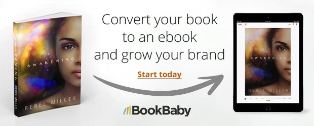
Here’s the brutal truth: your gorgeous Microsoft Word document is basically useless in the digital world. Every device thinks it knows better than you do. iPads will cheerfully rearrange your images. Kindles will gleefully resize your fonts. Phone screens will compress everything until your book resembles a grocery list.
Reflowable vs Fixed: The Choice That Changes Everything
Before you even think about fonts or spacing, you need to answer one crucial question: Do you want your book to adapt to different screens, or do you need every visual element locked in place?
Most authors should choose reflowable format. This means:
- Text flows naturally to fit any screen size
- Readers can adjust font sizes without breaking your layout
- Your book works beautifully on everything from phones to tablets
But if you’re working with a heavily illustrated children’s book or a cookbook where image placement matters, fixed layout might be your answer. Just know that you’re essentially creating a digital photocopy that doesn’t always play nice with smaller screens.
When Technology Gets Creative (Without Permission)
Digital devices have strong opinions about readability. They’ll override your design choices faster than you can say ‘creative vision.’ That ornate chapter heading font? Gone. Those precise image alignments? Scattered to the digital winds.
The secret is working with these constraints rather than fighting them. Tools like AI fiction writing platforms are getting smarter about digital-first formatting, while AI image generation services now offer commercial licensing for ebook-optimized graphics.
The Path Forward
Once you’ve conquered ePUB formatting, platforms like PublishDrive make distribution across multiple channels surprisingly painless. But that clean, professional look across all devices? That still requires understanding how digital publishing actually works, not how we wish it worked.
Your manuscript deserves better than a sloppy conversion. It just needs you to think like a screen instead of a page.